


Subscription churn canvas
This canvas helps you better understand your subscription churn. It gives you both the leading indicators of churn and an analysis of why it happened. Outputs from a churn review may require significant changes to a product roadmap or service improvement backlog. Churn analysis is a strategic exercise and should have strong representation from across your business, including your product team.
This comprehensive process should be considered where churn or future churn risk is significant. It tackles the systemic causes affecting many customers and the targeted interventions needed for a small number of high-risk, high-value customers.
The importance of leading indicators
Leading indicators represent signals that you can see before churn happens. This stops you from being reactive. Aim to catch signals of poor health as early as possible. For example, a high number of support calls about something not working (failure demand) versus a low number of calls seeking more from the product (value demand) could be an early indicator of churn. Contrast this with a B2B customer whose account has contracted, which, although valuable information, may suggest the customer has not been happy for some time. You still want to track this, but it would have been better to have had faster signals in place. The canvas uses Customer Health Indicators and Net Promoter Score (NPS) as leading indicators for churn.
The hidden impact of churn
Where a customer churns to a competitor or decides to create their own solution, you may never get them back. They may publicly discuss their dissatisfaction, which could impact future sales. Worse still, they could actively promote a competitor against you.
Churn process
A process has been provided below the churn canvas to help you get the most value from it. The canvas provides churn analysis, the process covers how to act on these insights. The canvas has two versions, one with mini instructions, as shown below and a blank version you can fill in. Tools like Miro are recommended for this activity.
Subscription Churn Canvas
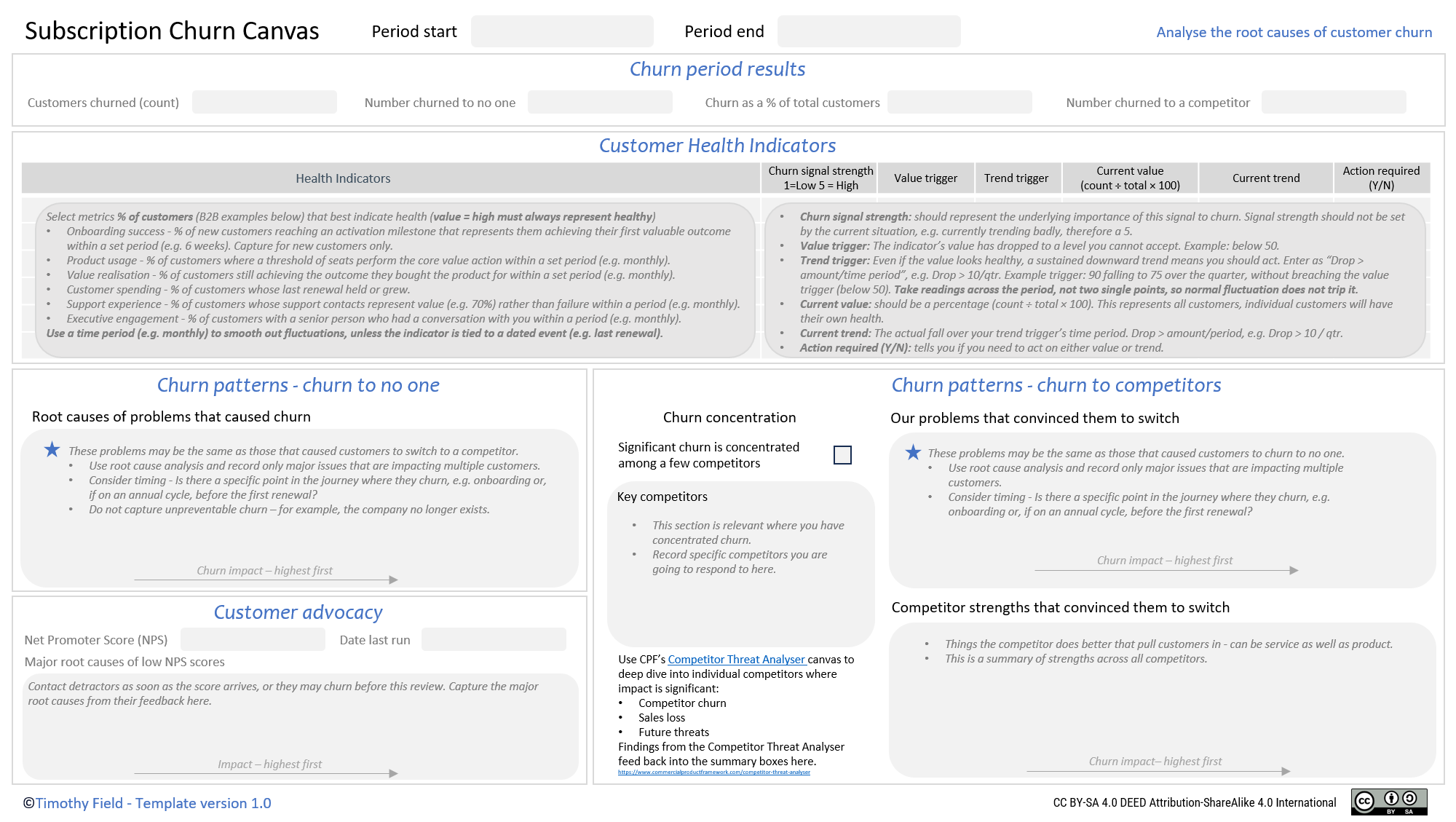
Feel free to recreate the canvas in a tool of your choice. Please attribute the author (Timothy Field), the source of the canvas (this webpage) and add the CreativeCommons BY-SA license
Churn period results
Health metrics provide a high-level view of health and can be used as Key Performance Indicators (KPIs). If churn is not a major issue, you may be monitoring these KPIs but not actively working on strategies to reduce it. This is important, as an organisation will have limited capacity and should not automatically take on work here. This prioritisation is considered in the Strategic Direction stage of the Commercial Product Framework.
Churn metrics
When considering the impact of churn, you may also wish to look at revenue loss. For example, 2 very large customers have left, creating a major impact on your organisation.
Customers churned (count)
Churn as a %age of overall customers.
Number churned to no one - customer churned, but did not join a competitor. You may find some of this churn is unavoidable, for example, the organisation has gone bankrupt.
Number churned to a competitor.
Customer Health Indicators
This section provides two sections:
Health Indicator selection
Analyse Health Indicators
After you have decided on your Health Indicators, consider reviewing them each churn analysis period (see process tab) to check that they are still the strongest warning signs available to you.
Health Indicator selection
Health Indicators are the strongest predictors of churn risk that you can reliably measure. These indicators sit within categories, such as product usage and relationship strength. They may be healthy right now, but they can give early warning signs that something is going wrong. Using the category of product usage, here are two anti-patterns:
Tied to a specific failure - The metric is tied to an important failure. For example, your reports engine keeps breaking, customers are fed up and are churning. This metric helps you see when the reports engine is stable but doesn’t capture any other part of the product. This will leave you blind to future issues.
Vanity metrics - The metric can look healthy even when value isn’t achieved. For example, the number of logins. This metric tells you that people have logged in, but not the value they have achieved. Vanity metrics can be dangerous because they may appear healthy even as customer value declines.
Selecting Health Indicators
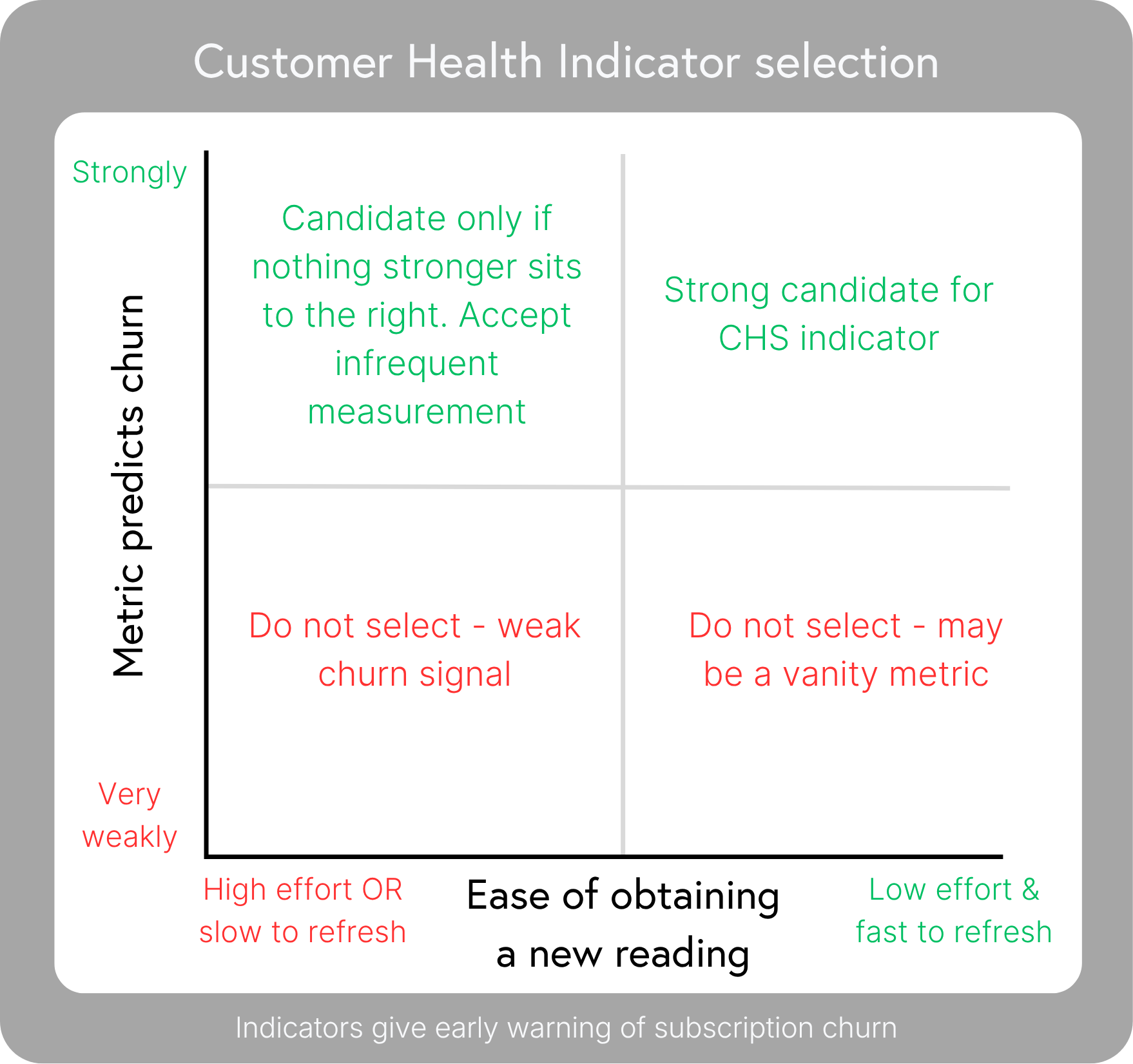
The grid below helps you select indicators within a health category (e.g. product usage):
Create a list of relevant categories starting with the recommendations below.
List candidate metrics for a category, then place each on the prioritisation grid. The selected metric becomes your Health Indicator. Build every indicator so that a high value always = healthy. You should have one indicator for each category.
These categories cover those that matter for most subscription-based products. Some example recommended metrics are provided for each category for B2B (Business to Business).
Onboarding success - % of new customers reaching an activation milestone that represents them achieving their first valuable outcome within a set period (e.g. 6 weeks). Capture for new customers only.
Product usage - % of customers where a threshold of seats perform the core value action within a set period (e.g. monthly).
Value realisation - % of customers still achieving the outcome they bought the product for within a set period (e.g. monthly).
Customer spending - % of customers whose last renewal held or grew.
Support experience - % of customers whose support contacts represent value (e.g. 70%) rather than failure within a period (e.g. monthly).
Executive engagement - % of customers with a senior person who had a conversation with you within a period (e.g. monthly).
Use a time period (e.g. monthly) to smooth out fluctuations, unless the indicator is tied to a dated event (e.g. last renewal). For example, if you measure logins on a single day rather than across the period, you may get wild variation.
These indicators monitor health that you can influence. If you want to record indicators you cannot influence (such as a customer going bankrupt), capture these outside of the canvas, so as not to distort the analysis.
Churn signal strength 1 = Low, 5 = High
Churn signal strength should represent the underlying importance of this signal to churn. Signal strength should not be set by the current situation, e.g. currently trending badly, therefore a 5.
Value trigger and trend trigger
In the grid below, you can see examples of when a value or trend should trigger a response. With a major churn problem, we run the exercise monthly, but measure the trend over the quarter, so a single month's dip does not trigger action on its own.
Value Trigger -The indicator has dropped to an unacceptable level, and you must act. Example: below 50.
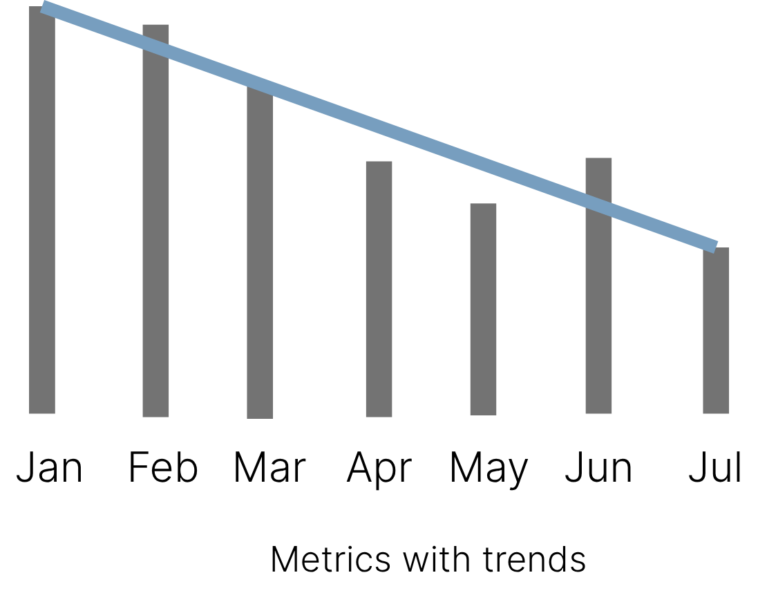
Trend Trigger -The indicator is declining at an unacceptable level, and you must act. Enter as “Drop > amount/time period”, e.g. Drop > 10/qtr. Example trigger: 90 falling to 75 over the quarter, is an unacceptable drop, even though it does not breach the value trigger (below 50). Take readings across the period, not two single points, so normal fluctuation does not trip it. The metric below fluctuates month to month, but when measured over the 6-month period, the readings reveal a sustained downward trend that a single before-and-after comparison would miss.
The window must be long enough that normal fluctuation evens out, so what remains is real direction. The more a metric fluctuates, the more readings you need across that window, and a rolling average of those readings makes the direction clearer.
Full example
This is an example of a fully populated grid for a B2B data product.
| Health indicator | Churn signal strength 1=Low 5=High |
Value trigger | Trend trigger |
|---|---|---|---|
| Onboarding success% of new customers performing data migration within 6 weeks | 5 | Below 70 | Drop > 5 / qtr |
| Product usage% of customers where 60% or more of seats run a query at least weekly | 5 | Below 75 | Drop > 10 / qtr |
| Value realisation% of customers whose data is actively consumed downstream (BI, apps, ML) each month | 5 | Below 80 | Drop > 10 / qtr |
| Customer spending% of customers whose last renewal held or grew | 4 | Below 85 | n/a, event based |
| Support experience% of customers where 70% or more of support contacts are value (questions, advice) rather than failure (outages, errors) that month | 3 | Below 75 | Drop > 10 / qtr |
| Executive engagement% of customers where a data leader had a conversation with you that month | 3 | Below 60 | Drop > 10 / qtr |
Analyse Health Indicators
We will use the example Health Indicators table above to show examples of data collection. Made-up values are in the grid below. The overall values roll up from a view of each customer.
Health Indicator analysis
To gather overall trends, we must start at the customer level for each Health Indicator. Ideally, you should automate this data gathering. This greatly reduces the effort required for the churn exercise.
| Customer | Seats active | Current value (% of seats) |
Current trend (fall over quarter) |
Action required | Action trigger |
|---|---|---|---|---|---|
| ABCDE Group | 34 of 40 | 85 | 85, up from 82 | No | – |
| FGHIJ Ltd | 8 of 20 | 40 | 40, down 4 from 44 | Yes | Value |
| KLMNO Ltd | 9 of 12 | 75 | 75, down 13 from 88 | Yes | Trend |
| PQRST Ltd | 13 of 25 | 52 | 52, down 2 from 54 | Yes | Value |
| UVWXY Ltd | 6 of 18 | 33 | 33, down 14 from 47 | Yes | Value + Trend |
| All customers | 2 of 5 pass | 40 (2 ÷ 5) | 40, down 20 from 60 | Yes | Value + Trend |
Churn patterns
This section covers churn analysis, the “churn to no one” and “churn to competitors” sections of the canvas.
Root causes of problems
You may find commonality in the churn reasons across both. The diagram below explains how to filter for major root causes. Aim for a small number of high-impact root causes to help you focus.

Many reasons:
Churn can be due to a combination of factors at the same time. For example, a poor client relationship and support calls not being dealt with quickly. Only record major issues that are impacting multiple customers. You may need to gather more information here. It can be difficult to get hold of clients after they have left, so having a robust research strategy run regularly, e.g., a quarterly customer satisfaction survey, is important. You can refer back to these for churned customers.
The main anti-pattern here will be to record “price”. This reason often reflects that the solution you are offering is not achieving the value they expected. It may be that your solution is fit for purpose, but a champion/purchaser has left, and the new leader does not understand your offering.
Common root causes - E.g. 10 customers weren’t happy with 8 different things each. At this point, you now have an unmanageable list of items. Some of these issues may be symptoms of the same problem. For example, 6 clients complained that their support issues were being ignored. With more detailed analysis of their support calls, you identify that the root cause was that there was no way for them to provide input into the product roadmap. With root cause analysis in place, you can address this.
Timing - Is there a specific point in the journey where they churn, e.g. onboarding or, if on an annual cycle, before the first renewal?
Record only those that are highest impact - You may have a lot of issues. Recording too many will make it more difficult to act.
Churn to no one
Use the instructions above to help you identify the root causes of the problems. These problems may be the same as those that caused customers to switch to a competitor. Do not capture unpreventable churn. For example, where the company is struggling financially or no longer exists.
Churn to competitors
Churn to competitors means a customer still has a strong need to solve a problem but isn’t happy with your offering. High switching costs may deter an organisation from leaving you even if they are unhappy with the factors below. This still represents risk, if a competitor reduces the switching costs, you can see a major loss of customers. Unhealthy NPS results and Customer Churn Indicators should give you advanced warning of this.
Churn concentration
You may have many competitors, but find churn is concentrated to just a few. Where this is the case, record these on the canvas and consider a deep dive using CPF’s Competitor Threat Analyser. This will help you formulate a more comprehensive response.
Our problems that convinced them to switch
Identify major root causes.
Competitor strengths that convinced them to switch
Here, you record specific strengths a competitor has that are driving customers away. It is common for product teams to focus on features here, however, there can be many more factors at play. For example, service quality can be just as important. Another example would be usability, your product may be highly functional, but if it is hard to use, they may still switch.
Customer advocacy
This section contains Net Promoter Score (NPS), which indicates how likely a customer is to recommend you. This likelihood is scored on a scale of 0 to 10. A poor NPS score can lead to churn. In addition, you may experience further damage from unhappy customers sharing their negative experiences.
NPS is a strong high-level signal of churn risk. Health Indicators infer satisfaction from behaviour such as product usage. NPS measures it directly. For example, a customer unhappy with your environmental credentials may still use the product regularly and gain value from it while looking for an alternative. In most cases, the cause eventually leads to customers using you less, getting less value, or pulling away from the relationship, which is what the Health Indicators measure.
Calculating NPS
Ask the following question to determine your NPS Score:
How likely are you to recommend us to someone?
Scores 0-6 are considered negative and may be at risk of churn.
7-8 are considered neutral.
9-10 are considered positive, with a high likelihood that they will personally recommend you.
The NPS score calculation ignores the neutrals.
NPS is calculated like this:
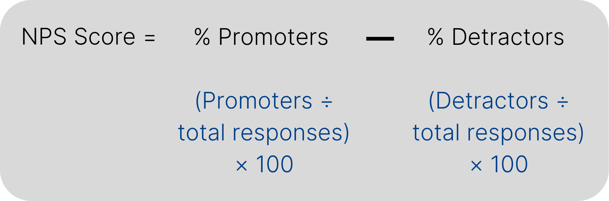
If detractors outnumber promoters, you may end up with a negative score, e.g. -20. Note: this is not a percentage but a score that can vary from -100 to 100.
The traditional approach was to send an NPS feedback request annually. This may be suboptimal as it represents a very slow feedback loop. Consider going faster, such as within quarterly or biannual relationship surveys. Always pair the NPS question with an open question asking why they gave that score.
Major root causes of low NPS scores
Contact detractors (scores 0 to 6) as soon as the score arrives. They may churn well before this review comes round, and you may need immediate tactical action to keep them. This section of the canvas is where you pull out the major root causes from that feedback across the period.
Process - Step 1 - Churn Analysis
This is the process for working with the canvas. A detailed process diagram is provided below to aid your understanding. You should have representatives from across your organisation, including product leadership.
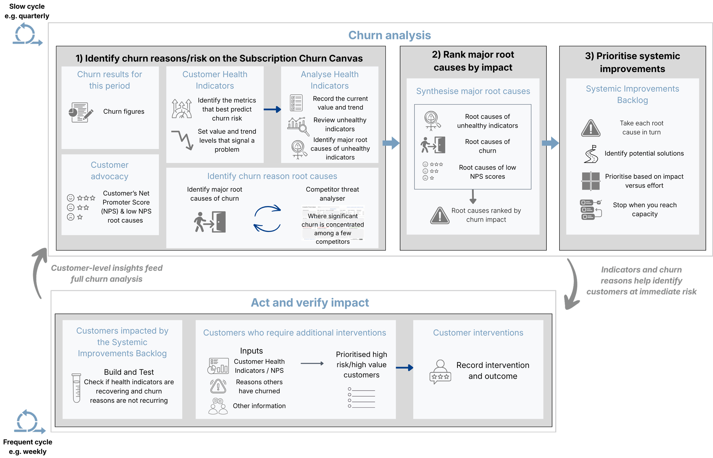
Churn review cycle
The canvas starts by capturing your formal review period, which reflects the “High-level churn analysis” below:
High-level churn analysis (slow cycle) - The full churn analysis looks for broader trends and makes strategic recommendations to improve your product or service. Due to the overhead of this activity, you should carefully consider how often you run this, for example, quarterly. You may wish to increase the frequency of formal churn analysis if you are in an unhealthy position. For example, you may run this quarterly by default, but move to monthly to address a major downturn. The output of this is a Systemic Improvements Backlog, in which work items will impact many customers.
Act and verify impact (frequent cycle)
Monitor the results of the work items in the Systemic Improvements Backlog. These should fix the majority of issues. This should significantly reduce the effort of dealing with each customer individually.
In some cases, you may have specific high risk/high value customers for whom you cannot wait. Prioritise and intervene in these specific cases. One type of intervention is to inform them about the upcoming systemic fixes. For example, they are having issues with data transfer, and your backlog of improvements includes a work item to fix this.
1) Populate the Subscription Churn Canvas
The tabs contain more detail on how to fill in the sections of the canvas:
Churn results - Set a period of time to monitor and consider your churn results. This includes Net Promoter Score (NPS), which tracks customer sentiment.
Health indicator selection - This section helps you select the best leading indicators for churn.
Churn analysis:
Churn to no one - The major reasons why customers churned but did not go to a competitor. Do not capture unpreventable churn. For example, where the company is struggling financially or no longer exists.
Churn to competitors - Churn to competitors means a customer still has a strong need to solve a problem but isn’t happy with your offering. Record the major reasons customers are unhappy and the major strengths of your competitors.
Customer advocacy - This focuses on Net Promoter Score (NPS). This score reflects how likely someone is to recommend you.
2) Synthesise major root causes
In this step, we are looking for common root causes of churn. They may come from the following:
NPS - Major root causes of low NPS.
Health indicators - Health indicators that have triggered on value or trend.
Churn patterns - Including commonality between why customers have left to no one and left to a competitor.
Synthesis of a clear root cause
An example of synthesis would be the common issue of a poor relationship behind these three problems:
In your NPS, you get a lot of feedback that “We never hear from you”.
Your “Executive engagement” indicator has triggered on value.
Customers who churned to a competitor cited better account management as a reason for switching.
Identifying hidden root causes
The previous synthesis example was possible because the root cause was easy to determine. What if it isn’t? Here’s a good example where product usage is low. From that data, we do not know why. What if you simply brainstorm this with your team?
Why is product usage low? The organisation’s champion has left.
Why is product usage low? The product is too hard to use for new people.
These guesses may lead to major investment in backlog items and fix nothing. In this case, you should carry out further research. This may involve meetings and surveys to deep dive into specific issues. If you are not sure, it is better not to make an assumption. The cost of research, let alone the potential solutions, is why you should be very careful with stating a root cause.
Most importantly - Be clear on the highest-priority issues that need tackling. Less is more here, a few high-priority issues are much easier to deal with.
3) Prioritise improvements
With churn risk and reasons now understood, you are ready to create and map your potential interventions.
Introducing the exercise
Let people know that they don’t have to do everything in one session. You may find some further analysis/thinking time is helpful.
Ask people not to map interventions that are obviously not worth doing. This avoids discussing too many options. If you have a large group, asking for 2 or 3 top ideas each can help. Limit the number of action items to what you can reasonably achieve.
Sometimes it’s hard to understand what each intervention is. For example, ”Create an automated process for when subscriptions churn to win clients back” may mean different things to different people. For one, it’s a simple email, to another, it’s a whole sales process. Acceptance criteria can help. For example, this solution is now much clearer:
Send an email with a 50% discount offer for the next year.
Contact the customer with a follow-up email after 1 week.
Now you are ready to explain the granularity of potential interventions:
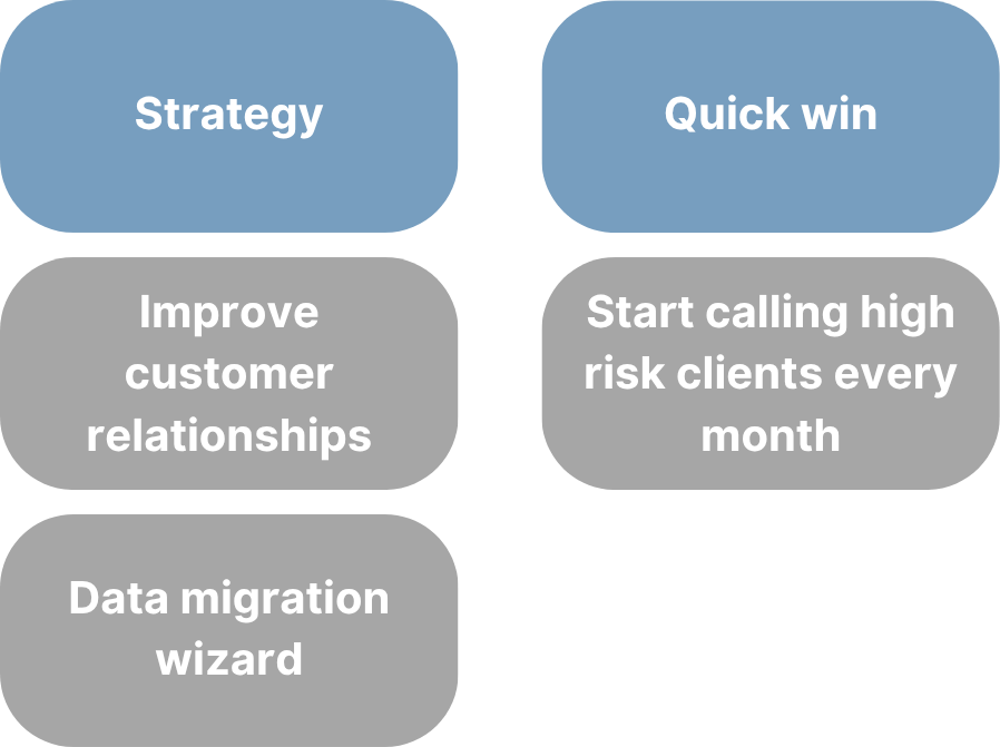
Ensure people label each intervention as either a strategy or a quick win:
Quick win - These are defined as a single work item that can be delivered quickly and independently with a high chance of success.
Strategy - These require a larger investment. When discussing investment on the grid, this is typically done in the amount of time you need to achieve a high-impact result. E.g. I want to spend 6 months on solutions for this. That doesn’t mean you have to spend exactly that amount of time, but it brings some realism to sizing. A “strategy” is identified by these criteria:
You have numerous possible solutions within the intervention. For example, “improve account management”. With this, I may regularly email clients, set up 1-to-1s, or create a new satisfaction survey. A strategy is well suited to where a whole area like account management is weak.
You may have a large solution that will take a significant amount of time to deliver.
You may have a large solution that can be delivered incrementally. For example, “automate data migration”. I may be able to deliver this in multiple software releases.
Map and prioritise the interventions
With these instructions clear, you are ready to map and prioritise your interventions:
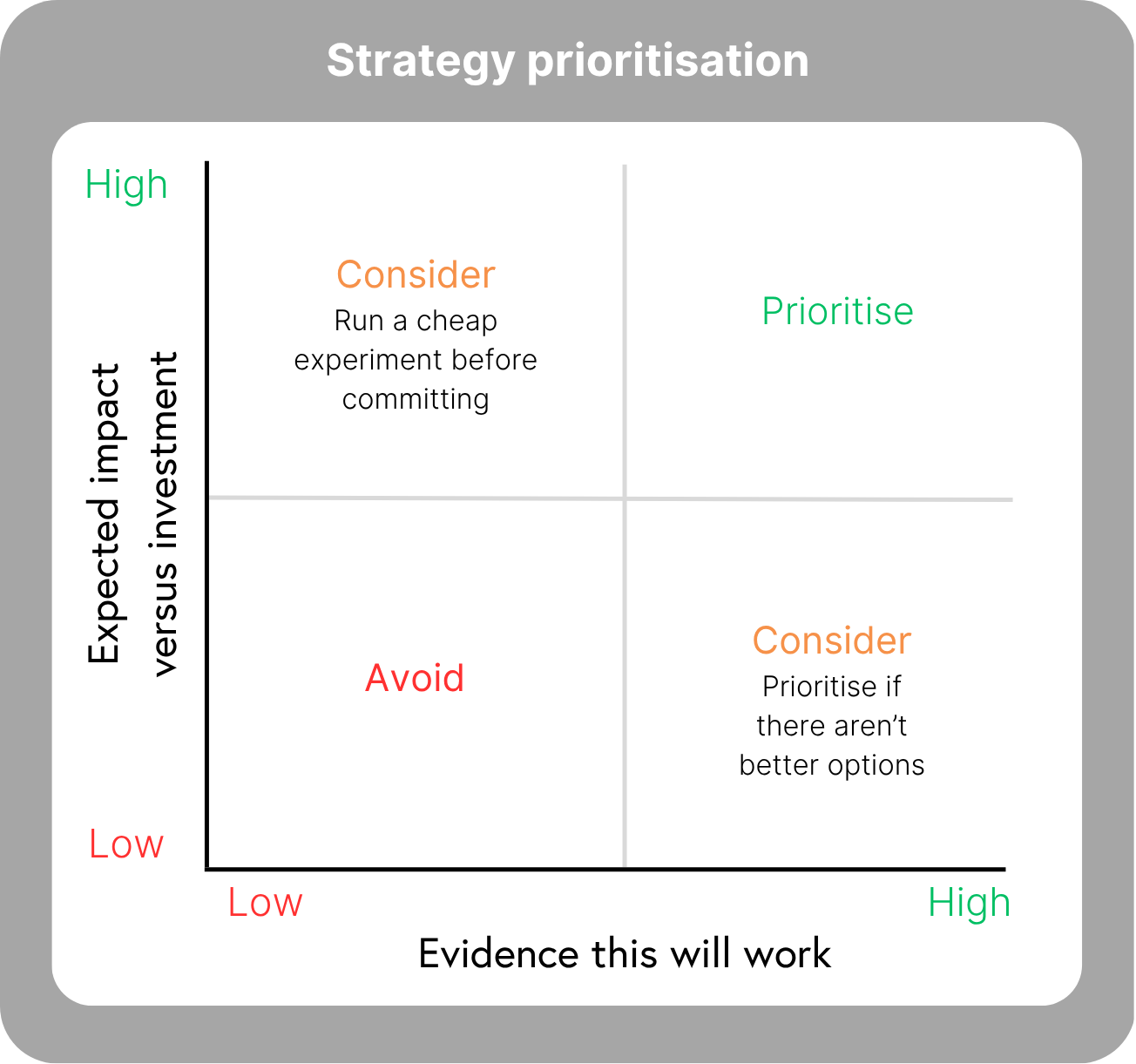
Structure your prioritised interventions
This section shows you how to structure each strategy and quick fix.
Strategy
A strategy may require a significant investment that needs to be considered alongside other organisational priorities. The lightweight strategy artefact below helps you justify why an intervention should be prioritised. This provides enough detail for a conversation:
Step 1: Capture a strategy item like the one below. This contains enough information for a leadership team to have a conversation about the solution, the problem it solves, and the investment required. Further detail can be captured outside of the artefact, for example, a basic design of the wizard. Although the exact figure of £600k ARR may not happen again, it is a good indicator of impact.
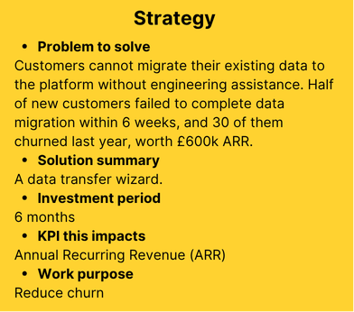
Step 2: After prioritisation, use CPF’s Strategic Area to structure and deliver the work.
Quick win
Be clear on the results you expect so you can validate that it has worked. For example, if a payment email isn’t being sent due to a system failure. In some cases, it may directly improve one of your Customer Health Indicators. The work and governance overhead of a strategy will not be worth it here.
Process - Step 2 - Act and verify impact
Within the fast cycle of act and verify, we have two main activities:
Monitoring the impact of our interventions - all customers impacted by the Systemic Improvements Backlog.
Customers who require additional interventions.
Customers impacted by the Systemic Improvements Backlog
Where possible, you should fix issues for all customers rather than making individual interventions. When multiple customers are affected by these, you can monitor their success globally. For example, if 50 customers are failing on product usage and 40 recover after your change, you know it is working
Customers who require additional interventions
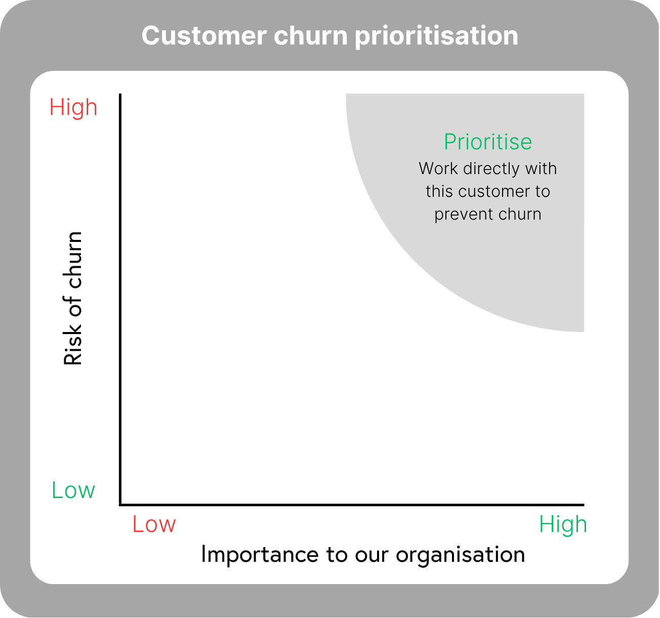
The chart will help you determine who to add to this list. Be ruthless about how many you prioritise. It is easy to map more and more customers until the list becomes unmanageable, and a long list can result in the work being done poorly, and eventually, the whole exercise being dropped.
This is best done as a discussion:
Risk of churn:
Health indicators for the customers, including trend and value. When ranking the risk of churn, consider the “churn signal strength” you gave each indicator. A low strength, for example, 1 out of 5, may not represent much risk even when it has triggered.
Low Net Promoter Score (NPS) - this includes values 0 to 6 out of 10.
Known reasons for churn.
Other inputs such as previous conversations with the customer.
Importance to our organisation:
Financial impact.
Reputational impact.
Relationship influence with other customers. For example, convincing many others to leave.
If you lack data, do not wait. Record the accounts you believe are at risk and act.
Monitoring individual customers
You may decide to store your information in your own system, for example, a CRM. This method is provided to help you consider what needs to be captured. The format below can easily be captured in a tool like Microsoft Excel.
Capture risks and actions:
Only capture major risks. There will be plenty of small issues, but this is for the ones that could genuinely cost you the customer. Recording everything creates noise and hides the risks that matter.
Record the source of the risk. Not every risk shows up in a health indicator. Record where each one came from: a health indicator triggering, a known reason for churn, or other information, such as a conversation.
Record the raised date so you can keep track of how long a risk has been open.
Walk through your list of risks to determine your actions. A customer with three risks may need three interventions, or one intervention may resolve several. Note where a systemic fix is being applied. If it will take time, you may still need a short-term action. For example, the data migration process is being rewritten, but you cannot afford to wait, so you help them do it manually in the meantime.
Take action:
Progress log - Record the results so you can see how effective the intervention has been.
Close a risk when you are sure it will not recur. For example, if you have fixed their data migration failure, but it could happen again, you should not close it.
Remove a customer when their risks have been dealt with. This is an important exercise to avoid too many actions overwhelming your team. You could consider a new mapping exercise on the prioritisation chart.
| Customer | ARR (optional) | Source (health indicator / known reason for churn / other information) |
Churn risk and evidence | Raised date | Systemic fix in progress | Intervention | Owner | Progress log | Risk cleared? |
|---|---|---|---|---|---|---|---|---|---|
| FGHIJ Ltd | £48k | Health indicatorValue + Trend | Value realisationNo data consumed downstream in the last 3 months, their BI reports have stopped running | 24/06/2026 | None | Exec review to find why reporting stopped, re-baseline the target outcome, rebuild the pipeline to fit their new tooling. | David | 26/06/2026 exec review held, their reporting team moved to a different BI tool after a restructure. 08/07/2026 pipeline rebuilt to feed the new tool, watching for consumption to resume. |
No |
| Health indicatorValue | Product usage8 of 20 seats ran a query in the last month (40%), threshold is 60% | 19/06/2026 | SIB-04 | Enablement session now, cannot wait for the fix to land. | David | 03/07/2026 enablement session run, 14 of 20 seats now active (70%). 17/07/2026 usage held for two weeks, back above threshold. |
Yes | ||
| KLMNO Ltd | £22k | Health indicatorTrend | Product usage9 of 12 seats ran a query in the last month (75%), down from 88% over the quarter | 07/07/2026 | SIB-04 | None, covered by the systemic fix. | Priya | 10/07/2026 decline is slow, holding for the fix rather than intervening. | No |
| Other information | Champion leavingBob Willis has resigned, last day 29/08 | 14/07/2026 | None | Get introduced to his successor before he leaves, transfer the success plan, build a second contact. | Priya | 14/07/2026 Bob confirmed his departure, successor not yet appointed. 17/07/2026 handover session agreed for early August. |
No | ||
| ABCDE Group | £120k | Health indicatorValue + Trend | Executive engagementNo senior conversation in the last 3 months, previously monthly | 02/07/2026 | None | Secure a replacement exec sponsor, book a review, multithread beyond a single contact. | Susan | 02/07/2026 no senior contact reachable since the reorganisation. 09/07/2026 intro call with new VP Ops, review booked for 24/07. |
No |
| Other information | Budget under reviewFinance signalled a cost cutting round in the last call | 11/07/2026 | None | Build a value case with hard numbers, get it in front of finance before the budget round closes. | Susan | 11/07/2026 value case drafted from their own usage data. 16/07/2026 awaiting a slot with their finance lead. |
No | ||
| UVWXY Ltd | £15k | Known reason for churn | Competitor approachNamed competitor running a proof of concept with their data team | 09/07/2026 | SIB-11 | Walk them through the roadmap now, the trial will conclude before the fix ships. | Priya | 09/07/2026 gap confirmed as scheduling limits, already on the roadmap. 15/07/2026 roadmap walkthrough held, they have paused the trial. |
No |
| PQRST Ltd | £30k | Health indicatorValue | Support experience50% of support contacts in the last 3 months were failure demand, threshold is 30% | 30/06/2026 | SIB-09 | Weekly check in until the defect fix lands and ticket volume falls. | David | 30/06/2026 over half of their tickets trace to the same import defect. 09/07/2026 fix confirmed for release 4.2 in August, weekly check in continuing. |
No |
| Other information | Evaluating AI solutionsTheir data team is scoping an in house AI build for the same workflow | 12/07/2026 | SIB-11 | None, covered by the systemic fix. | David | 16/07/2026 no budget approved yet, roadmap session booked for August. | No |